McAfee
Refreshing a security product and brand to deliver confidence and joy
The Challenge: Stale brand, unclear value
McAfee is a decades old brand best known for the antics of its founder, as well as desktop security products whose value is little understood in a mobile centric world.
As the Head of Brand and User Experience my challenge was to help refresh a brand that had relied on fear messaging to motivate users to purchase, and also relied on user toil to capture the product value.
As McAfee’s product strategy shifted to online safety, we needed to move the company away from relying on fear and toil toward confidence and joy
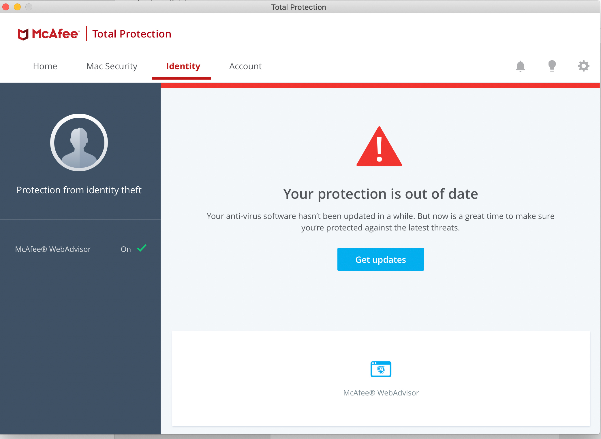
Older McAfee desktop product
The Challenge: A stale brand and unclear user value
McAfee is a decades old brand best known for the antics of its founder, as well as desktop security products whose value is little understood in a mobile centric world.
As the Head of Brand and User Experience my challenge was to help refresh a brand that had relied on fear messaging to motivate users to purchase, and also relied on user toil to capture the product value.
As McAfee’s product strategy shifted to online safety, we needed to move the company away from relying on fear and toil toward confidence and joy

Older McAfee desktop product
The Approach
Instill confidence and joy, capture value playfully
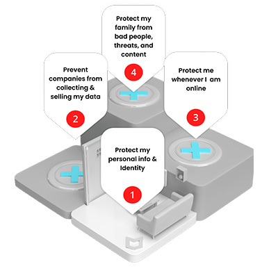
After intensive segmentations research and working with a vendor brand agency, we aligned on a brand promise of “McAfee’s protections frees and empowers us to enjoy life online.’
What follows are artifacts detailing how we brought the verbal and visual identity to life in the brand refresh, as well as how we unified the products into a mobile-centric tool for users to tune their “protection goals” to the amount of online and device security they desired.
I personally led the creation of the product strategy “concept car” video at right. We created in house with US-based Principal Product Designer Brent Dietrich and Australian Visual and Motion Designer Mel de Beer. This video was used to tell the story of a future vision of McAfee that is just one unified product, and that creates upsell experiences in context to demonstrate value to the user.
The XLT was thrilled. We used this video to inspire, inform, and galvanize divergent product teams toward a singular product strategy.
Video can playback at full screen
THE APPROACH
Instill confidence and joy, capture value playfully
What follows are artifacts detailing how we brought the verbal and visual identity to life in the brand refresh, as well as how we unified the products into a mobile-centric tool for users to tune their “protection goals” to the amount of online and device security they desired.
I personally led the creation of the product strategy “concept car” video at right. We created in house with US-based Principal Product Designer Brent Dietrich and Australian Visual and Motion Designer Mel de Beer. This video was used to tell the story of a future vision of McAfee that is just one unified product, and that creates upsell experiences in context to demonstrate value to the user.
The XLT was thrilled. We used this video to inspire, inform, and galvanize divergent product teams toward a singular product strategy.
Video can playback at full screen
"McAfee's protections frees and empowers us to enjoy life online."
This brand promise is an extract of the overall McAfee brand strategy which is the foundation of McAfee’s new Visual and Verbal Identity.
"McAfee's protections frees and empowers us to enjoy life online."
This brand promise is an extract of the overall McAfee brand strategy which is the foundation of McAfee’s new Visual and Verbal Identity.
VISUAL IDENTITY
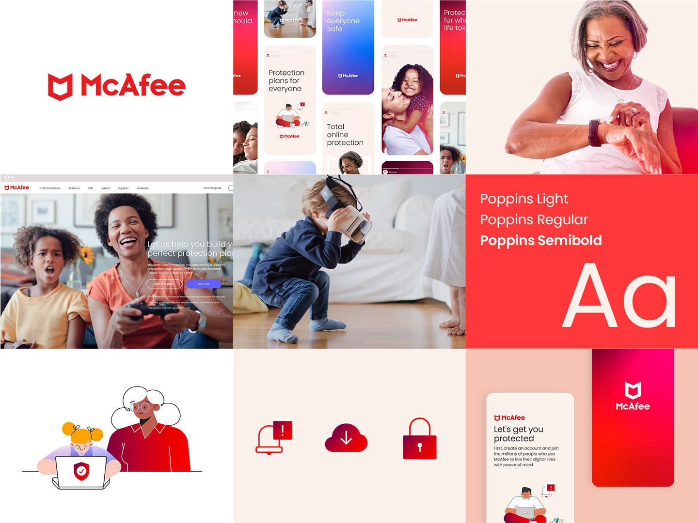
McAfee Visual Identity Overview
A design ethos is born from a brand strategy and underpins all of our communications both internally and externally.
The brand visual identity brings McAfee’s brand to life through:
-
Typography that is approachable and open
-
Simple, clear layouts with distinct graphic elements
-
A refined use of soft tones and neutrals with vibrant accent colors
-
Intentional use of photography to engage and represent our target audiences
-
A set of gradients that are expressive and distinct
.

VISUAL IDENTITY
McAfee Visual Identity Overview
A design ethos is born from a brand strategy and underpins all of our communications both internally and externally.
The brand visual identity brings McAfee’s brand to life through:
- Typography that is approachable and open
- Simple, clear layouts with distinct graphic elements
- A refined use of soft tones and neutrals with vibrant accent colors
- Intentional use of photography to engage and represent our target audiences
- A set of gradients that are expressive and distinct
VERBAL IDENTITY
The McAfee Voice Framework
Voice Persona: Who We Are
An easy-to-remember, internally facing character McAfee writers can “wear” and use to check how we write and speak. It does not appear in client-facing communications, nor does it need to be trademarked.
Voice Principle: How We Activate
High-level writing tactics that help us bring our persona to life. Not all principles will be weighted equally when creating content, but taken together, they shape our expression. We can modulate them as appropriate.
VOICE PRINCIPLE 1
A positive perspective
We keep it positive with optimistic points of view and energizing, evocative language while sharing relevant and relatable examples.
VOICE PRINCIPLE 2
Connect the dots
We share what they need to know, anticipating their needs while conveying all that we offer in a down-to-earth and simple way.
VOICE PRINCIPLE 3
Share in their journey
We’re helpful and reassuring, empathizing with their experience while using supportive and warm language to express our genuine commitment to their peace of mind.
VERBAL IDENTITY
The McAfee Voice Framework
Voice Persona: Who We Are
An easy-to-remember, internally facing character McAfee writers can “wear” and use to check how we write and speak. It does not appear in client-facing communications, nor does it need to be trademarked.
The Encouraging Ally
Dynamic and helpful, we meet consumers where they are, leading with bold and relatable points of view. We take the time to appreciate the everyday moments, offering our optimistic perspective while informing smart decision-making with conviction.
Voice Principle: How We Activate
High-level writing tactics that help us bring our persona to life. Not all principles will be weighted equally when creating content, but taken together, they shape our expression. We can modulate them as appropriate.
VOICE PRINCIPLE 1
A positive perspective
We keep it positive with optimistic points of view and energizing, evocative language while sharing relevant and relatable examples.
VOICE PRINCIPLE 2
Connect the dots
We share what they need to know, anticipating their needs while conveying all that we offer in a down-to-earth and simple way.
VOICE PRINCIPLE 3
Share in their journey
We’re helpful and reassuring, empathizing with their experience while using supportive and warm language to express our genuine commitment to their peace of mind.
Experience Principles
Bringing our brand promise into our product design required we do many rounds of validation of conceptual models. What we anchored around (and refined) were principles we found would help act a decision framework to galvanize diverse teams to “empower us to enjoy life online.”
Engaging environments
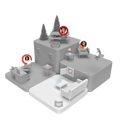
We don’t live in dashboards. We live in environments we wish to interact with and protect. What we care about most is home and our families. We put this at the heart of our UI metaphor.

Interactive goals
We’re much more likely to complete something if the motivation is higher than the effort to complete it. And if it’s our idea.
Rather than McAfee tell the user what tasks they need to do to be safe, we created an interactive Protection Score where users could decide their desired amount of security and the effort to accomplish it.

Simple, Seamless
Previously McAfee services required moving across different apps and experiences to complete tasks which was an overwhelming amount of user toil.
We focused on removing the organizational boundaries that found their way into our products to allow users to capture value from all our services seamlessly.

Recognizable metaphors
Recognition over recall. Knowing vs learning. These are powerful principles for overcoming cognitive load, especially for not well-understood services such as security.
We indexed on providing metaphors users understood rather than industry jargon to allow users to readily engage and re-engage.
Experience Principles
Bringing our brand promise into our product design required we do many rounds of validation of conceptual models. What we anchored around (and refined) were principles we found would help act a decision framework to galvanize diverse teams to “empower us to enjoy life online.”

Engaging environments
We don’t live in dashboards. We live in environments we wish to interact with and protect. What we care about most is home and our families. We put this at the heart of our UI metaphor.

Interactive goals
We’re much more likely to complete something if the motivation is higher than the effort to complete it. And if it’s our idea.
Rather than McAfee tell the user what tasks they need to do to be safe, we created an interactive Protection Score where users could decide their desired amount of security and the effort to accomplish it.

Simple, Seamless
Previously McAfee services required moving across different apps and experiences to complete tasks which was an overwhelming amount of user toil.
We focused on removing the organizational boundaries that found their way into our products to allow users to capture value from all our services seamlessly.

Recognizable metaphors
Recognition over recall. Knowing vs learning. These are powerful principles for overcoming cognitive load, especially for not well-understood services such as security.
We indexed on providing metaphors users understood rather than industry jargon to allow users to readily engage and re-engage.
Environment Explorations
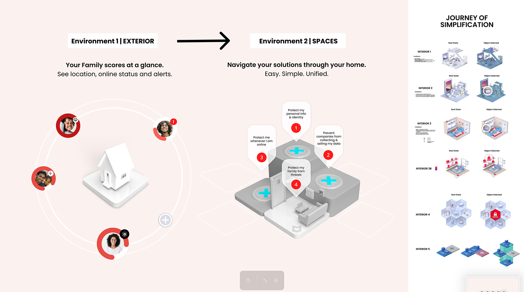
We explored many, many UI metaphors before settling on building the experience around environments that acted as our background and setting. We sought to reduce to base simplicity, start outside to show home and all the users. Inside we created rooms that provided different types of capabilities where users could “Marie Condo” their desired protections. Rather than users having to scroll to take actions, we brought the actions to the users in their representative environment.

The Outcome
The strategy & vision video (again, at right) was very positively received by senior leadership and informed, inspired, and galvanized divergent product team’s goals into a singular strategy.
Alas, it was not to be. McAfee was bought out by private equity and the new owners prioritized short-term profitabilty and incremental optimizations over long-term growth. Budgets were cut back and the team was broken up.
The brand refresh is in the McAfee products today, and the protection score concept from the strategy made its way into new updates.
