The Challenge: Overcoming a legacy
After more than seven years since a major update, the Kindle apps for iOS and Android were due for a refresh. Years of tech debt left an overweight left navigation menu, difficult new book discovery, and required multiple taps to exit and return to a book. Though the app would benefit from a modern update, users had become accustomed to it. The Kindle 10th Anniversary was an opportune moment to launch the update. Partnering with 11 different teams that each owned a portion of the app, we raced against the clock to craft a valued gift for our customers on Kindle’s birthday. .
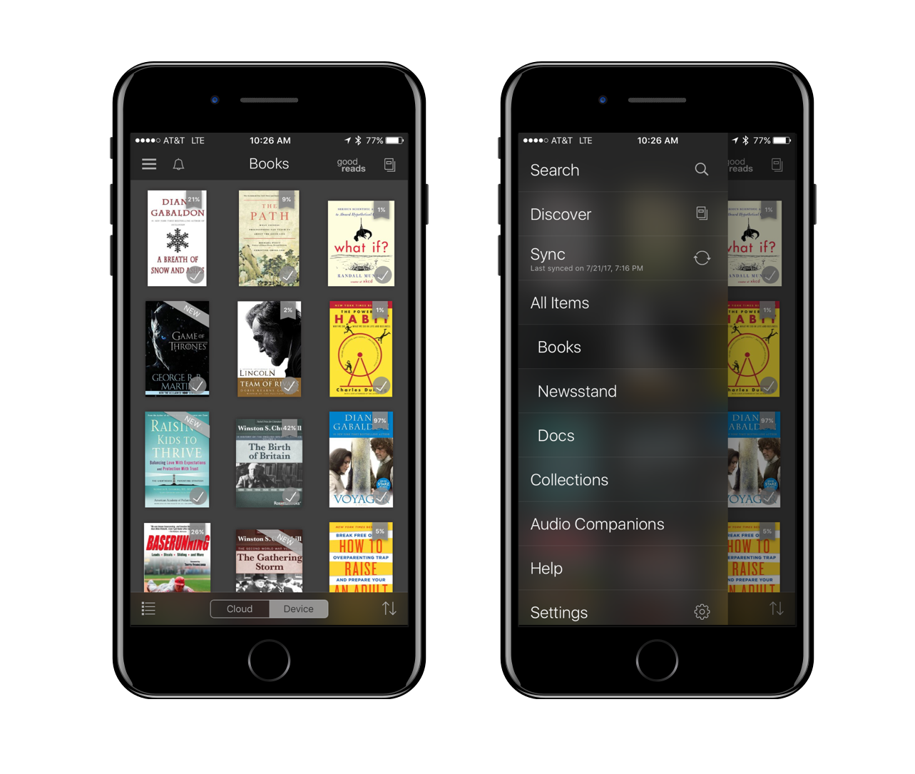
The legacy Kindle app for iOS.
The Challenge: Overcoming a legacy
After more than seven years since a major update, the Kindle apps for iOS and Android were due for a refresh. Years of tech debt left an overweight left navigation menu, difficult new book discovery, and required multiple taps to exit and return to a book. Though the app would benefit from a modern update, users had become accustomed to it. The Kindle 10th Anniversary was an opportune moment to launch the update. Partnering with 11 different teams that each owned a portion of the app, we raced against the clock to craft a valued gift for our customers on Kindle’s birthday. .

The legacy Kindle app for iOS.
The Approach
A familiar and scalable navigation pattern
Adopting a familiar tabbed navigation pattern, we were able to unpack the left navigation menu that had become a “Monica’s closet” for new features, leaving them not readily discovered by users. Tabs afford users instant identification of where they are in the app, and ability to rapidly pivot where they want to go next, thereby increasing user engagement.
One tap to resume reading
By placing a signifier of the most-recently read user’s book cover in the bottom navigation bar, we created a way for the users to rapidly return to reading their book from virtually anywhere in the app. This gave users the ability to confidently explore and discover in the app, yet still map to the rapid re-open benefit of physical books.
Simplify new book discovery
The new navigation pattern also allowed for persistent search at the top-level pages. Extracting this key functionality from the left navigation removed extra taps, and also reinforced search as a key navigation and discovery tool.
Increase customer's feature awareness
Kindle is a surprisingly deep and feature rich app, particularly when immersed in the reading experience. Many physical book users, and indeed some Kindle readers, were unaware of the many benefits of E-books. My role also included creative direction, vendor management, and design delivery of 11 feature awareness videos posted on the Kindle storefront to increase awareness of Kindle’s benefits.
THE APPROACH
A familiar and scalable navigation pattern
Adopting a familiar tabbed navigation pattern, we were able to unpack the left navigation menu that had become a “Monica’s closet” for new features, leaving them not readily discovered by users. Tabs afford users instant identification of where they are in the app, and ability to rapidly pivot where they want to go next, thereby increasing user engagement.
One tap to resume reading
By placing a signifier of the most-recently read user’s book cover in the bottom navigation bar, we created a way for the users to rapidly return to reading their book from virtually anywhere in the app. This gave users the ability to confidently explore and discover in the app, yet still map to the rapid re-open benefit of physical books.
Simplify new book discovery
The new navigation pattern also allowed for persistent search at the top-level pages. Extracting this key functionality from the left navigation removed extra taps, and also reinforced search as a key navigation and discovery tool.
Increase customer's feature awareness
Kindle is a surprisingly deep and feature rich app, particularly when immersed in the reading experience. Many physical book users, and indeed some Kindle readers, were unaware of the many benefits of E-books. My role also included creative direction, vendor management, and design delivery of 11 feature awareness videos posted on the Kindle storefront to increase awareness of Kindle’s benefits.
Increasing efficiency by improving the tool chain.
One of my first tasks when joining the Kindle Design Studio was to encourage the studio to migrate our design tools from Adobe Creative Cloud to Sketch, Flinto, and Sketch Measure. The redesign of the app seemed an ideal time to demonstrate the efficiency of designers doing their own prototyping in Flinto, and automating redlining using Sketch Measure. A few weeks after our early proof-of-concepts, the entire studio followed our team’s lead and made the switch. This effectively added headcount by eliminating time-consuming redlining, and allowed designers to make quick decisions with rapid prototyping.
The Outcome
On Kindle’s 10th Anniversary, iOS and Android customers were given a new update that included light and dark theming, new navigation, a quick way to resume reading, and quicker and simpler ways to find new books to read. Reviews trended positive to neutral.
Amazon’s new Kindle app adds a light theme and deeper Goodreads integration.
Beyond the fresh coat of paint, Amazon is adding a new “one-tap access” feature that floats your current book at the bottom of the app in a miniaturized rectangle that follows you around the app. That way, you can easily jump back in at any time.
Amazon overhauls its Kindle app with new features and a fresh design.
Amazon’s Kindle app has been relaunched with new features and a streamlined design that’s easier on the eyes… You’ll soon notice larger book covers than before, as well as a new light background theme to accompany the existing dark one. New fonts also give you more options when you go to read your book.
Amazon’s Kindle app overhaul delivers easy reading and socializing.
…The UI has been refreshed overall, with a keen focus on making it easier to access your stuff. Specifically, the search bar is everywhere in the app.

